Case Studies · VV's Coffee Company
A drive-thru hut with a car-meet following, and a website to match.
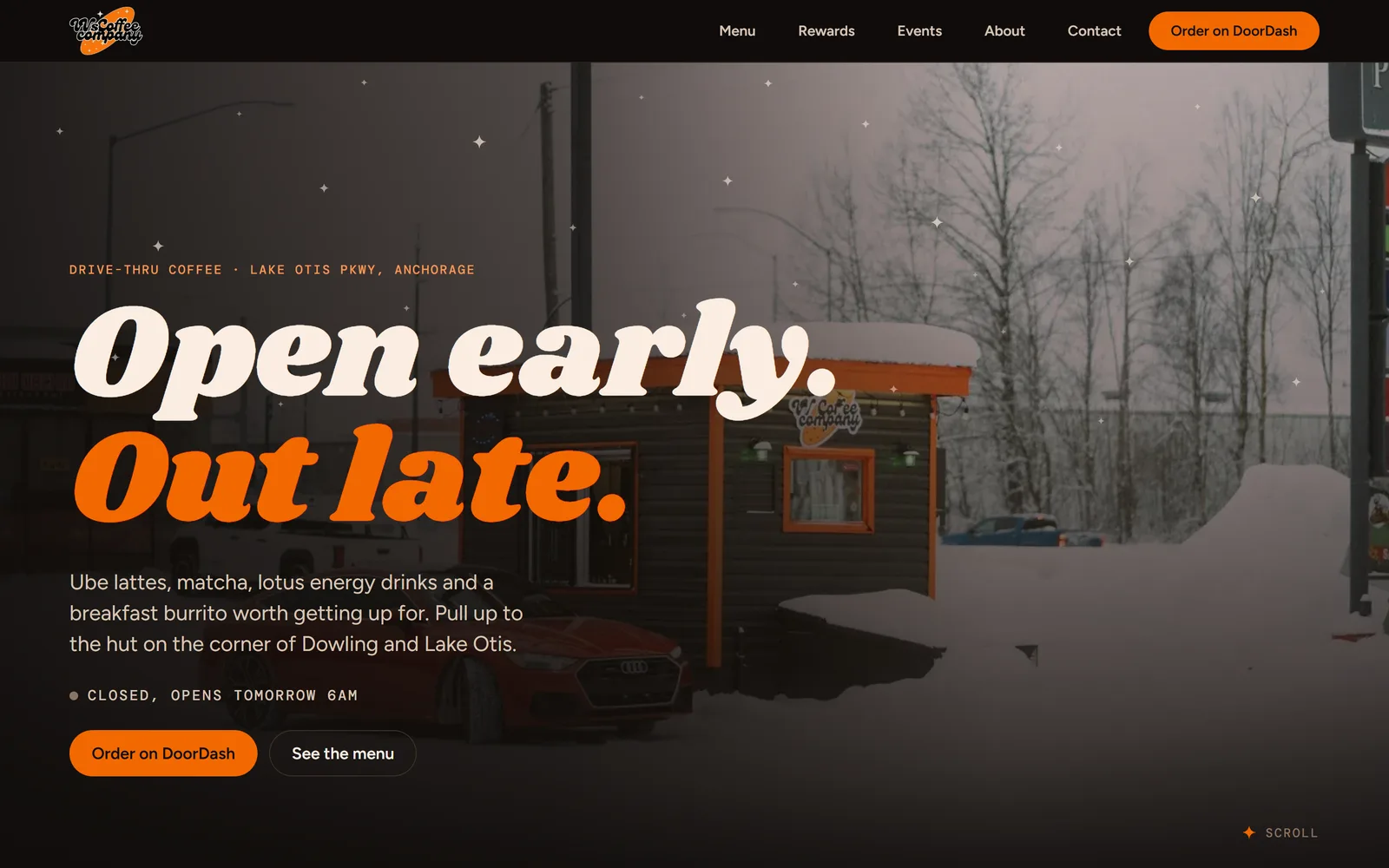
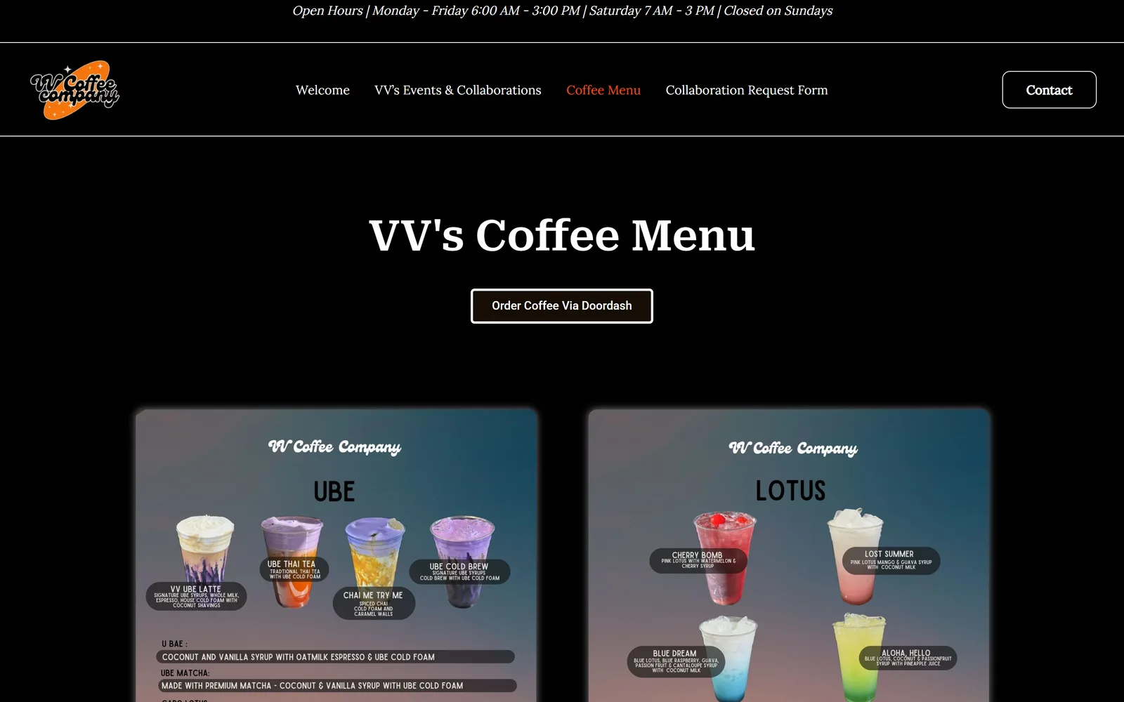
VV's Coffee Company is a drive-thru coffee hut on Lake Otis Parkway in Anchorage: ube lattes, matcha, lotus energy drinks, and a calendar of Cars & Coffee meets, Halloween popups and R&B nights. Northtek had already built their digital rewards card. The website was next: a WordPress template that showed the menu as photos of the menu board, and a Gmail address on the sign. We rebuilt it in one day on the look of their punch card, and put their email on their own domain.
The Brief
"I need a new website and a new email."
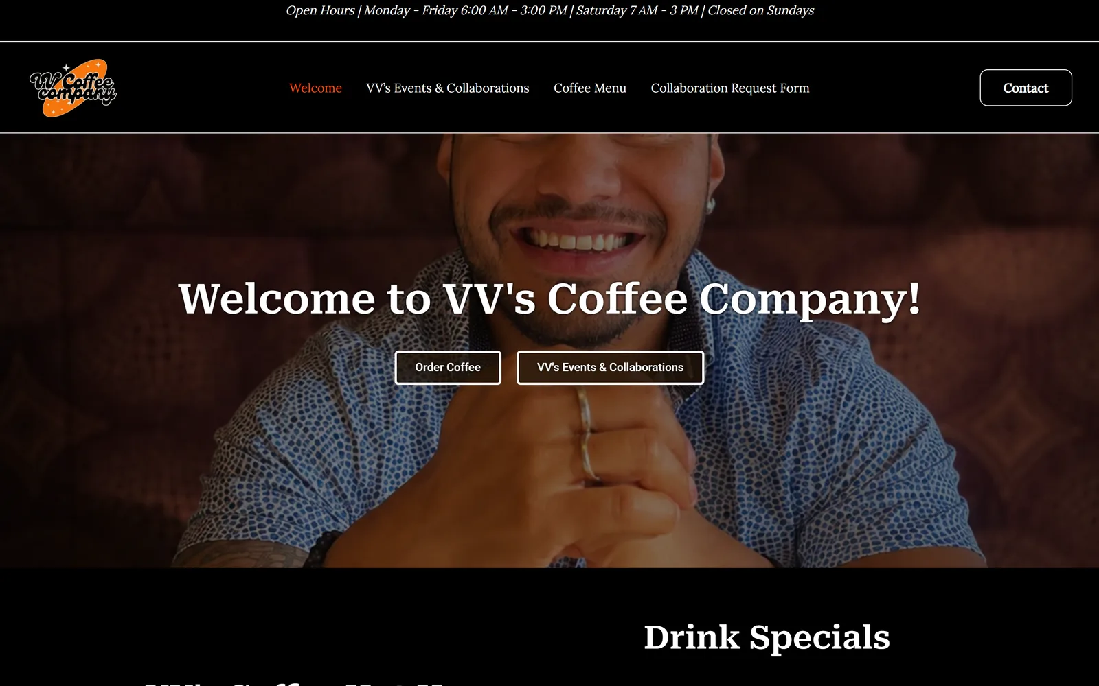
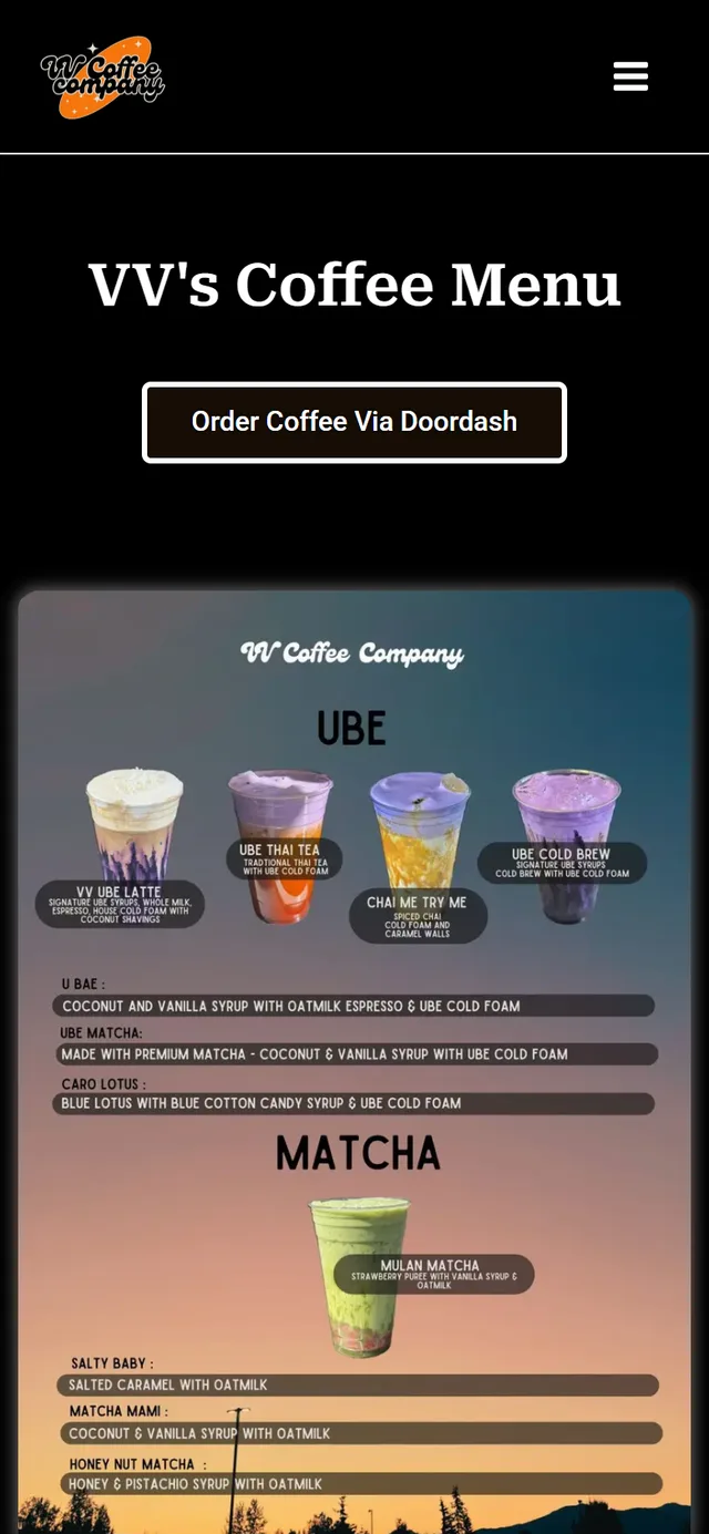
That was the whole brief, said across the counter. VV's opened in March 2024 and has been busy ever since: a named-drink menu that turns over monthly, a loyalty program we had just moved into Apple and Google Wallet, and more events than most venues in town. The website did not reflect any of it. It was a WordPress template with a stock photo in the hero, the menu uploaded as JPEGs of the menu board, flyers piled into a gallery, and an online-store page that said ordering was closed.
We had one real advantage: the brand was already decided. Weeks earlier we had designed VV's rewards punch card and an eleven-piece print kit around it, and the owner loved it. The job was to take that look, black ground, VV orange, the chunky italic headline face and the four-point star, and make it a website. Then move the business email off Gmail and onto vvscoffeeco.com.
The Transformation
Before and after, page by page.
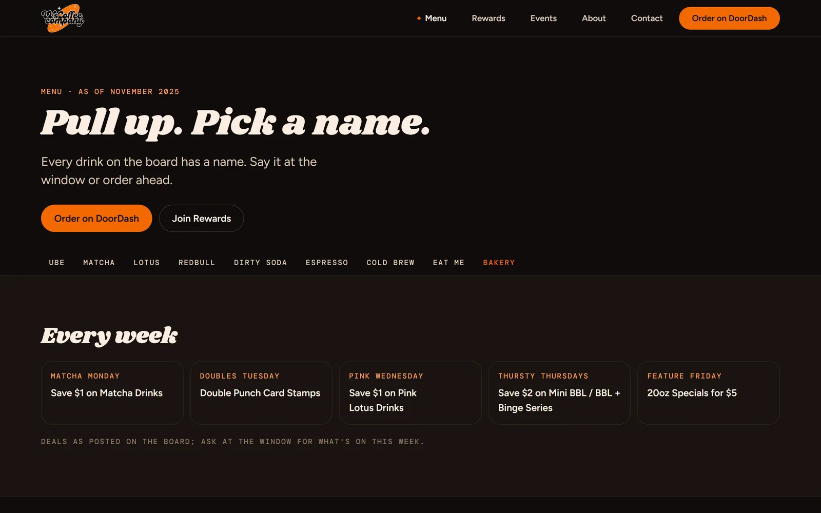
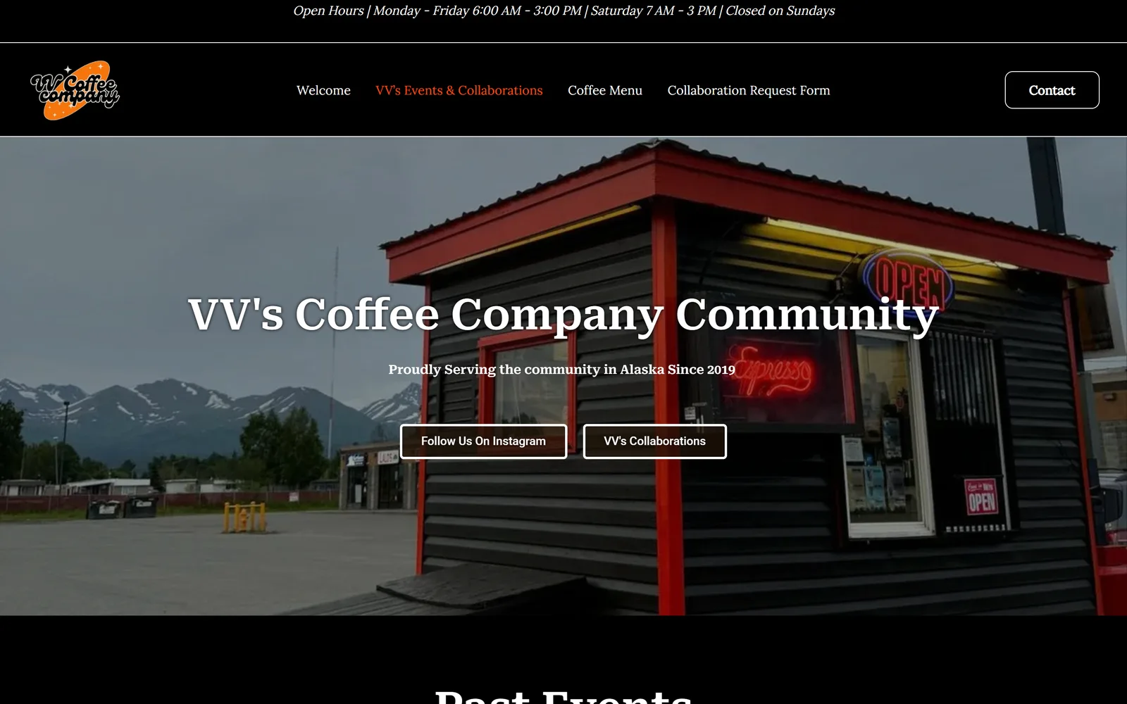
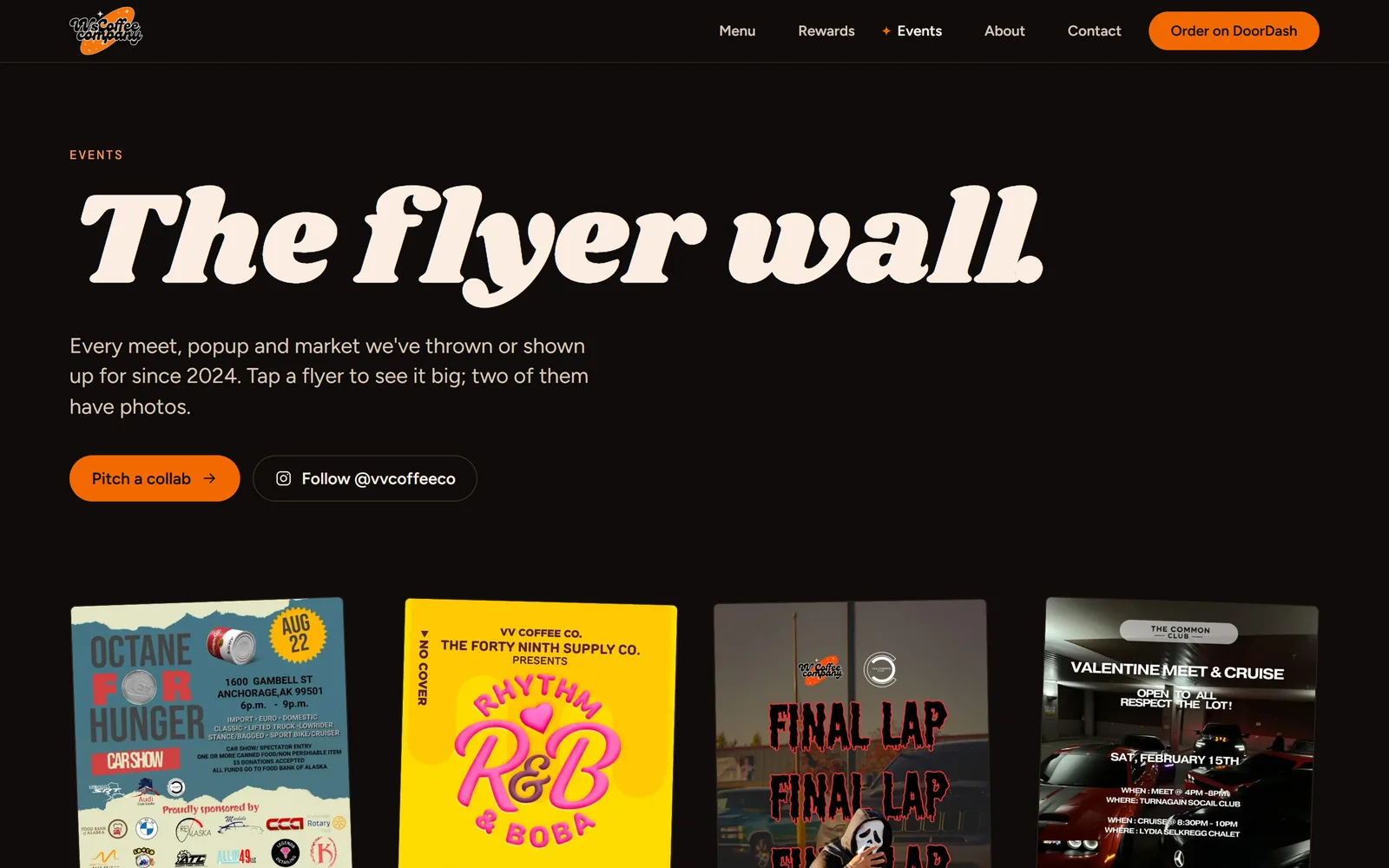
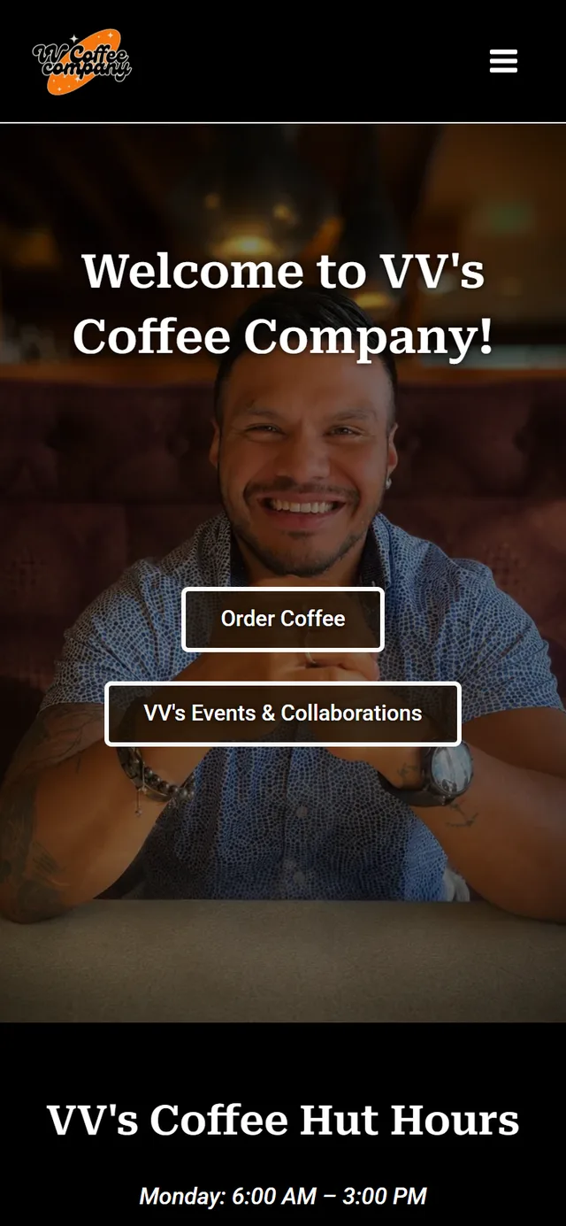
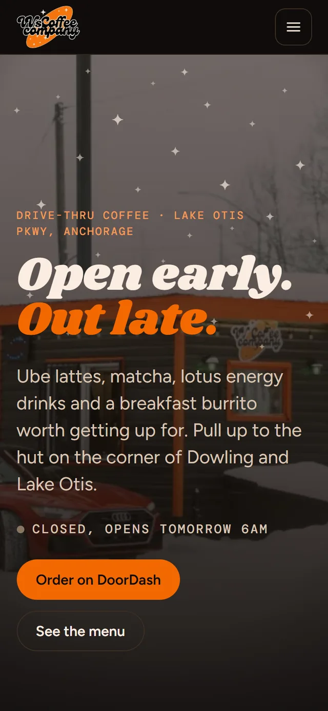
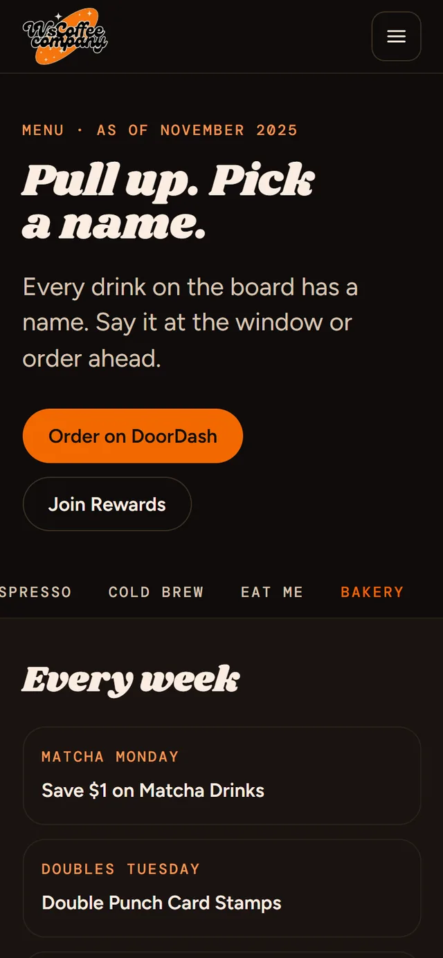
Same hut, same drinks, same phone number. Every screenshot below is the real page, uncropped, captured the day the new site went live.
Menu
Events
On a phone, where customers actually look up the hours
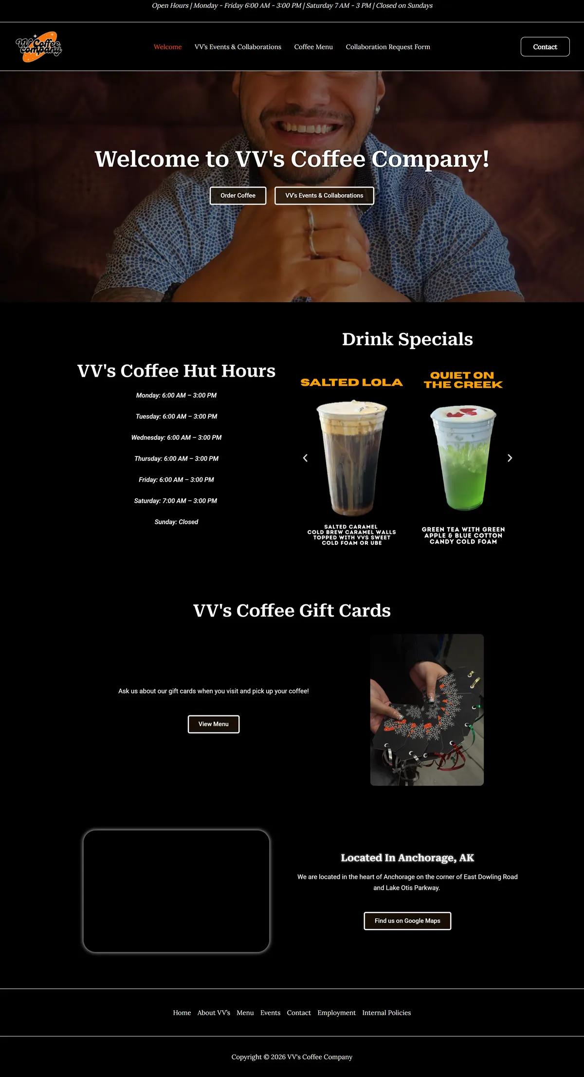
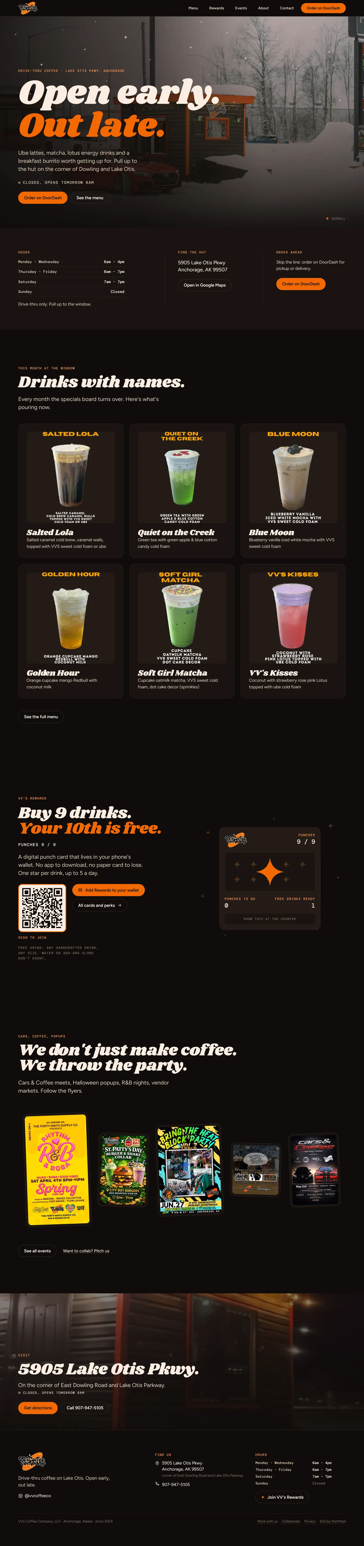
The whole homepage, top to bottom
Full-length captures at the same scale. The old page was a hero, a specials carousel, the hours and a map. The new one walks a first-time customer from "are they open" to the menu, the specials, the rewards card, the events and the directions.
Part One
One decision, carried through every page.
The rewards card gave us the palette, the typeface and one ornament: a four-point star. On the site that star is the punch on the card, the bullet in every list, the active marker in the navigation and the night sky over the hut. Nothing else decorates. Every photo on the site is the owner's own, taken at the hut or at an event, and every one gets the same warm tint and vignette so phone snapshots and designed flyers sit on the same stage.
Part Two
The punch card that fills as you scroll.
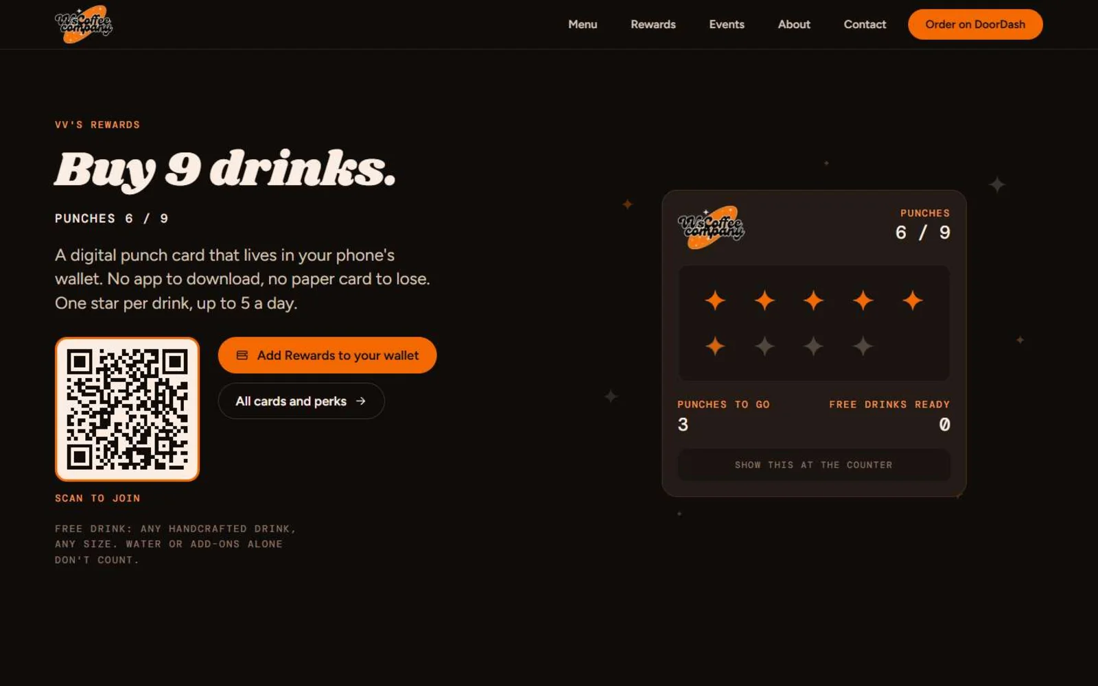
The site has one signature moment, and it sells the loyalty program. Halfway down the homepage the rewards card pins to the screen while nine orange stars land one at a time in step with your scrolling. The tenth lands bigger, and the headline flips to "Your 10th is free." Next to it: the real QR code and an Add to Wallet button, so a customer can join from the page. On phones the card fills once as it scrolls into view. Anyone who has asked their phone to reduce motion sees the finished card and no animation.
Open now
The sign at the top of the page reads Anchorage time and says "Open now until 7pm" or "Closed, opens tomorrow 6am". Hours live in one file; the footer, the contact page and the data search engines read all follow it.
Three cards, one page
Rewards, the paid Members card and the YMCA discount each get a QR code and a wallet button on the Rewards page, with the rules written out so staff and customers agree.
Named drinks
Seventy of the owner's drink-special cutouts, catalogued by month, so the homepage always shows the current board and the archive is ready when a special comes back.
Part Three
Nothing for the owner to maintain.
We pulled every image off the old site, about 150 of them, and sorted each one: menu boards, drink specials by month, event flyers with their dates and venues, and the photo sets from two popups. The menu boards were transcribed into real text. The flyers became the poster wall. The two photo sets became galleries behind their flyers. The store, the cart and the pages no customer needs were retired.
The contact, hiring and collaboration forms land in the owner's inbox with the sender as the reply-to, behind a honeypot and a rate limit. There is no WordPress, no plugins and no admin panel to keep patched; the site is static files on a global network, and the only thing that changes month to month is the specials board, which we update from the owner's own artwork. Her new email runs on Google Workspace at vvscoffeeco.com.
Under the Hood
Engineering receipts.
- 01Next.js 16, every page prerendered as static HTML
- 02Hours logic covered by unit tests, including the Alaska time zone and the Sunday-to-Monday rollover
- 03Scroll choreography on transform and opacity only, with a reduced-motion fallback on every effect
- 04No horizontal scroll at 320 to 390px, verified on every route
- 05LocalBusiness structured data with opening hours, sitemap and Open Graph image
- 06150 source images converted to WebP with responsive sizes
- 07Form relay with honeypot, validation and a per-IP rate limit
- 08Custom SVG icon set, no icon library, no tracking scripts
What's Next
Your shop could look like this by tomorrow.
This one started as a conversation at the counter. If your website is a template with your menu uploaded as a photo, we would like to see it. No pitch, no pressure.